MMTech's Central CRM is a trading platform serving FX brokers, prop firms, hedge funds, and social traders. When I joined, the dashboard was technically functional but practically overwhelming. Users landed on a page competing with too many elements at once, with no clear sense of what to do first or where their most important information lived. Key actions were buried, data had no context, and the navigation offered no logical structure for the range of services the platform offered.
The goal was to redesign the dashboard to reduce cognitive load, surface the actions users needed most, and create a foundation that could scale as the product grew.
The old dashboard had everything on it, which meant nothing stood out. A few specific issues were clear from the start:
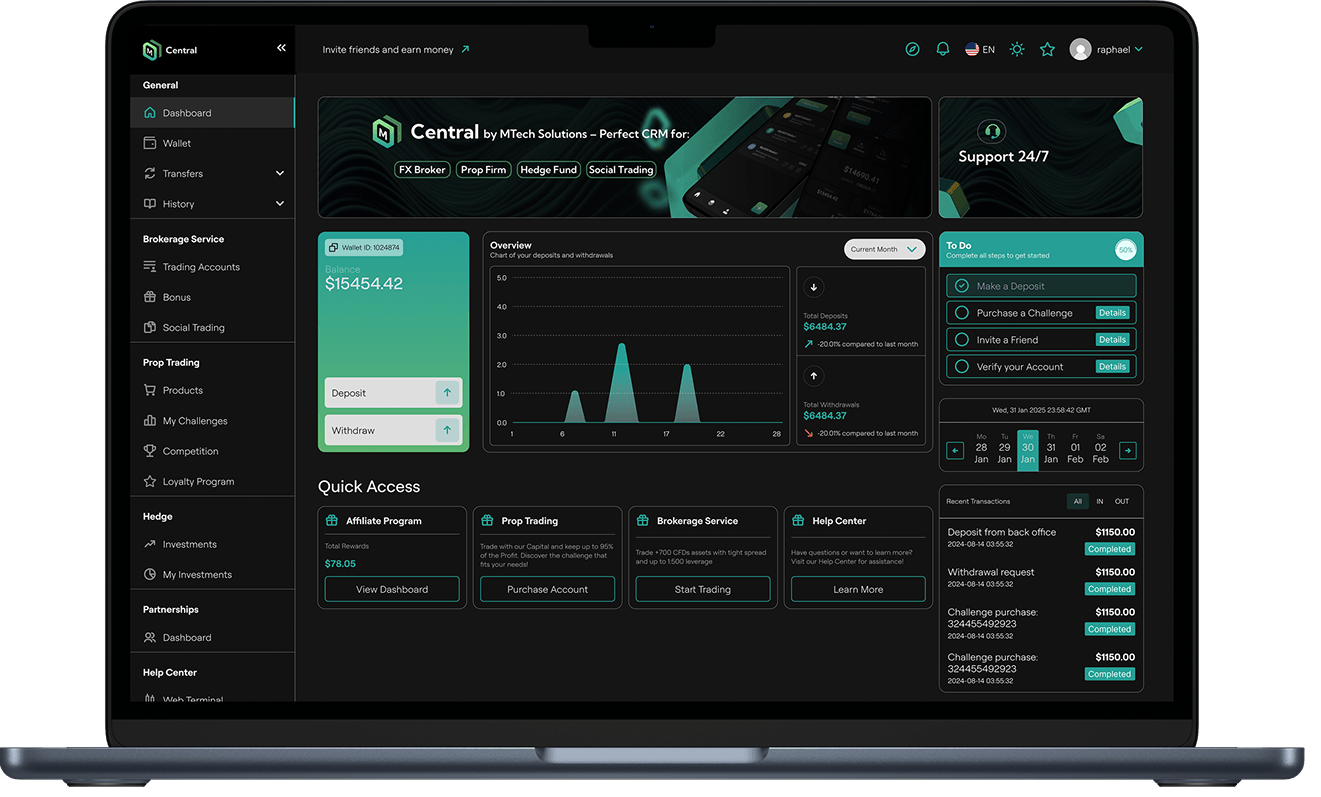
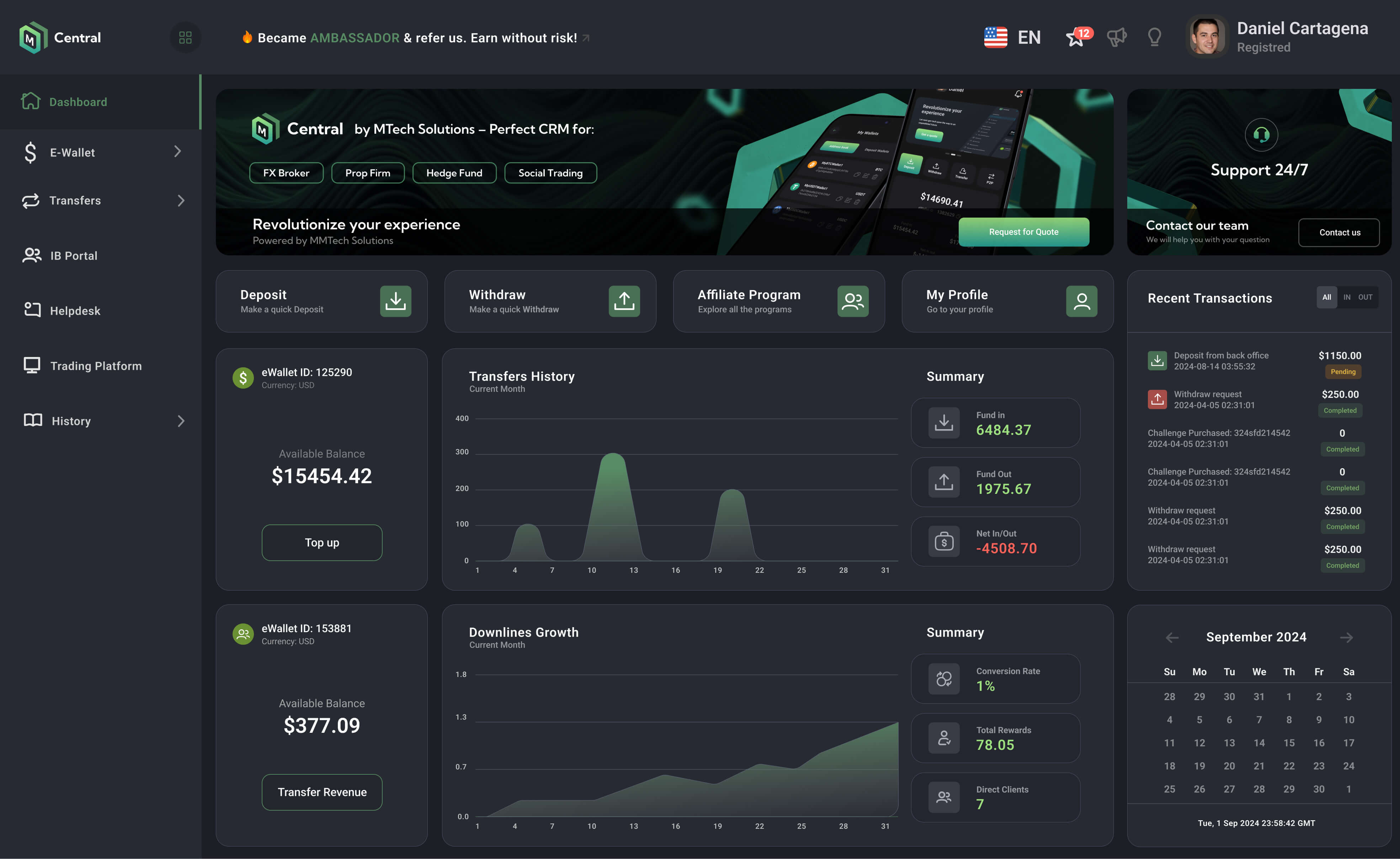
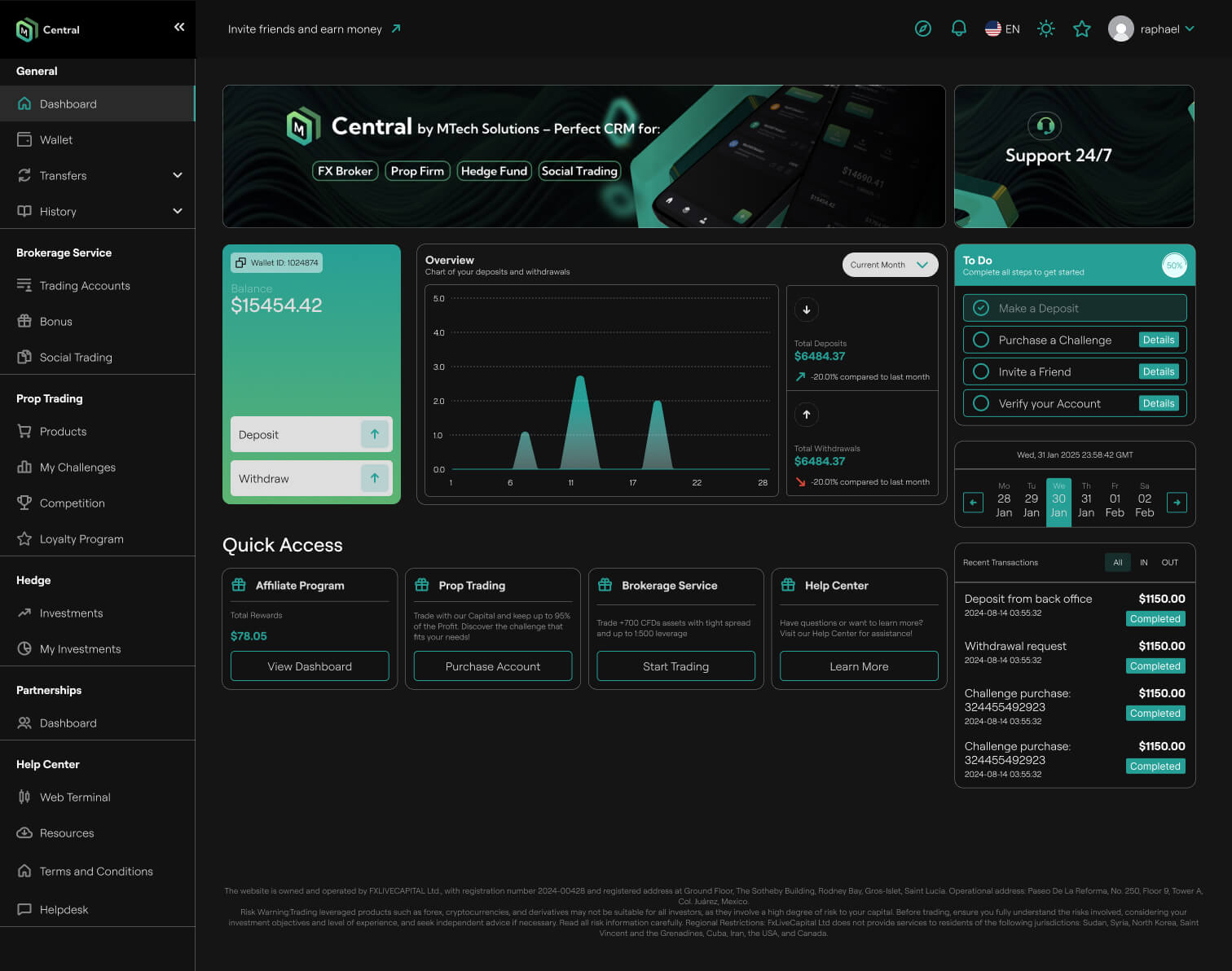
Deposit and Withdraw, the two most frequent user actions were tucked inside a wallet card, competing visually with a chart, a to-do checklist, a calendar, and a transactions list all at the same level of visual weight.
The overview chart showed deposit and withdrawal activity but gave no summary figures alongside it, forcing users to interpret raw graph shapes rather than read actual numbers.
The sidebar navigation grouped items inconsistently, mixing brokerage tools, prop trading features, hedge fund access, and help resources with no clear separation, which made the platform feel more complex than it needed to be.
For new users especially, the dashboard created more questions than it answered.
Rather than a cosmetic refresh, I focused on restructuring the information architecture before touching visual details.
I moved Deposit and Withdraw out of the wallet card and into prominent standalone action tiles at the top of the dashboard, alongside Affiliate Program and My Profile. These four tiles reflect the most common entry points based on user behaviour, so they needed to be immediately visible on arrival.
I redesigned the financial overview section to pair the transfers chart with a Summary panel showing Fund In, Fund Out, and Net In/Out as clear figures. Users no longer had to interpret a graph to understand their position. The numbers are right there.
I restructured the sidebar navigation into clearly labelled groups that match how users actually think about the product: general account management at the top, then brokerage services, then prop trading, then partnerships. Each section is visually separated so users can orient themselves quickly regardless of which part of the platform they are using.
The redesigned dashboard reduced the visual complexity of the most-used screen in the product while adding more information where it mattered. Users in the brokerage and prop trading tiers now land on a dashboard that immediately reflects their balance, recent activity, and next actions without needing to navigate anywhere first.
The platform also became significantly easier to onboard new clients onto, as the structure now reflects the natural flow of getting started: deposit funds, explore services, track performance.


